Skip to main contentSkip to footer
    Back to Case Studies
    FURIVUSExecutive Consultation
    Landing PageHand-CodedConsulting

    Furivus

    The executive consultation practice of Furi Kfir Flatow, a strategy consultant who advises 10 to 250-employee companies in tech and tourism. One senior person does all the work, so the site had to feel like one person's letterhead, not an agency's template.

    Project Preview
    1
    HTML file, no framework or build step
    6
    Sections from hero to booking
    3
    Engagement tiers presented
    4
    Selected engagements shown

    Editorial type system

    Playfair Display for the oversized headline, Instrument Sans for reading, IBM Plex Mono for eyebrows and figures, all loaded from Google Fonts with system fallbacks.

    Ivory and bronze palette

    Ivory paper, near-black ink and a bronze accent that carries the emphasis in the headline, with a dark roast tone for the nav button and footer.

    GSAP scroll choreography

    A branded preloader, staggered hero reveal, count-up figures and section reveals driven by GSAP 3.12 and ScrollTrigger, with Lenis smoothing the scroll.

    Reduced-motion fallback

    If the visitor prefers reduced motion or the animation libraries fail to load, everything is shown at once and the preloader is removed.

    Problem, method, proof

    Three pain-point quotes, three fixed-scope engagement tiers with durations, and four worked engagements each laid out as problem, what I did, outcome.

    One call to action

    Every path ends at a 30-minute Calendly intro call, with a copy-to-clipboard email as the fallback and a downloadable CV in the hero.

    The problem

    Furi Kfir Flatow went independent in 2023 after big-three strategy consulting in the United States and in-house strategy roles at two global consumer brands in Germany. Furivus is that practice: portfolio strategy, pricing, profitability and cost mapping for companies of 10 to 250 people in tech and tourism, worldwide, on about two hours of the client's time per week.

    The pitch is that there are no juniors, no hand-offs and no hundred-slide decks. A templated consulting site, with its stock photography and service grids, would have contradicted that in the first second. The site needed to read like a considered document from one person, and it needed to get a busy owner to a thirty-minute call without making them work for it.

    What the consultant needed

    • One page, one person: A single scrolling page in a voice that is plainly his, with no navigation maze.
    • Proof before promises: Client brands and a testimonial near the top, then concrete engagements described as problem, work and outcome.
    • A clear product: Three named engagements with scope and duration, so a prospect knows what they are buying before the call.
    • Nothing to maintain: No CMS, no dependencies to update, hosted somewhere that does not need attention.

    What we built

    The page, top to bottom

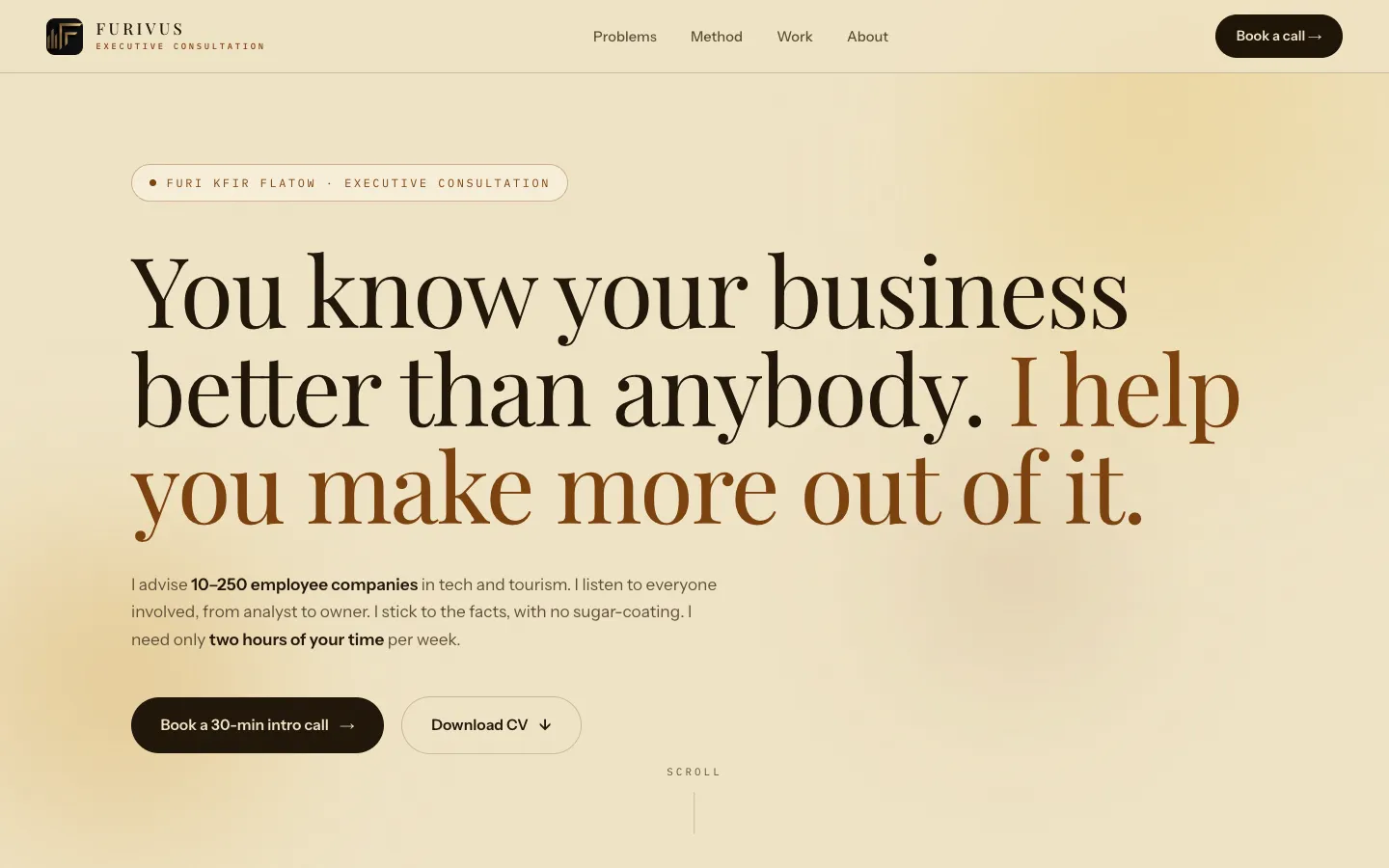
    Hero: eyebrow, a two-tone Playfair headline, the ten-to-250-employee positioning, a Book a 30-min intro call button and a Download CV button
    Proof band: client logos, four count-up figures, a scrolling capability ticker and a managing director's testimonial
    Problems: three pain-point quotes an owner might recognise, ending in Let's fix it
    Method: Diagnose, Prioritize and Plan ahead, each a fixed scope with a stated duration and how it builds on the previous one
    Selected work: four engagements in active tourism, tech, a Fortune 500 distributor and a national tourism body, each as problem, what I did, outcome
    About and contact: the person behind the practice, tools, languages and education, then the Calendly call and an email that copies to the clipboard

    Type, colour and rhythm

    The typography does most of the design work. The headline is Playfair Display at a size that fills the viewport, with the second sentence shifted to bronze so the eye lands on the promise. Body copy is Instrument Sans; figures, eyebrows and the capability ticker are IBM Plex Mono with wide letter-spacing, which gives the page the feel of a printed report rather than a brochure. The palette is an ivory ground, a near-black ink, a soft ink for secondary text, bronze and amber accents and a dark roast for the header button and footer.

    Motion with a floor under it

    The page opens with a short preloader: the mark, the name sliding up, a thin amber bar and a percentage counter. GSAP then staggers the hero in, ScrollTrigger reveals each section and counts the figures up as they enter, and Lenis smooths the scroll. The important part is the fallback. If the visitor has asked for reduced motion, or if the animation libraries fail to arrive, the script shows every element immediately and removes the preloader, so the worst case is a static page, never a blank one.

    How it works

    One file

    Markup, a CSS custom-property design system and the script live in a single HTML document of roughly 59 KB. The only external requests are two GSAP scripts, Lenis and the fonts.

    No build, no framework

    There is nothing to compile and nothing to upgrade. Editing the site means editing the file; deploying it means pushing it to Vercel.

    Conversion path

    Book a call appears in the header, the hero, the problems section and the closing section. The email address copies to the clipboard on click and confirms with a small toast.

    Accessible by default

    A skip-to-content link, aria labels on interactive controls, alt text on every image and a reduced-motion path that is a first-class state rather than an afterthought.

    Where it stands

    What we can and cannot claim

    The site is complete and linked to a Vercel project, but the repository does not record a public URL, so this page does not link to one. The counts above (one file, six sections, three engagement tiers, four selected engagements) are taken from the code. The savings figures and client outcomes shown on the page are the consultant's own statements about his engagements, not results we measured, and we have no traffic or booking data to report.

    You know your business better than anybody. I help you make more out of it.

    Furivus, hero

    What This Project Does Well

    The whole site is a single hand-written HTML document: styles, markup and script in one file, no bundler, no framework
    Six sections that follow the consultant's own sales conversation: pain, method, proof, person, call
    A client-logo row and a testimonial placed directly under the hero, before any explanation of services
    Motion that degrades to a plain, fully readable page rather than a blank one when animation is unavailable
    A skip link, labelled controls and alt text on every image
    Deployed as a static site on Vercel with nothing to maintain

    Technologies Used

    Hand-written HTML5 and CSS custom properties, vanilla JavaScript, GSAP 3.12.5 with ScrollTrigger, Lenis smooth scrolling, Google Fonts (Playfair Display, Instrument Sans, IBM Plex Mono), Vercel static hosting

    Ready to Build Something Similar?

    Let's discuss how we can help transform your business with a custom digital solution.