The problem
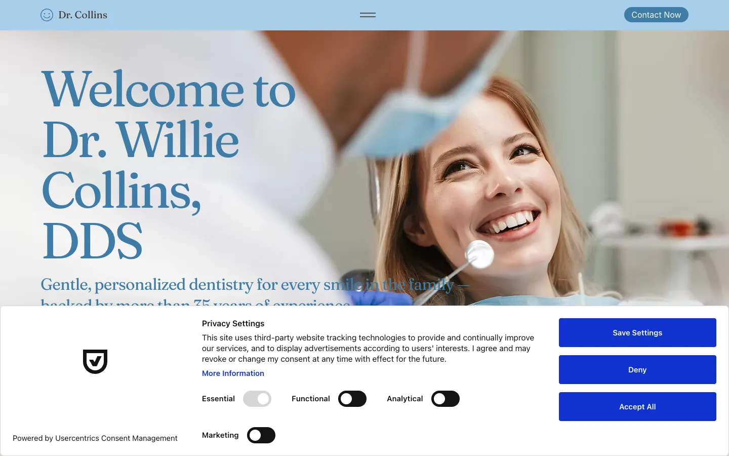
Dr. Willie F. Collins has practised dentistry in Opelousas, Louisiana since 1987. The practice takes new patients, accepts Medicaid and most insurance, and covers family, restorative and cosmetic work plus emergency care. Its website lives on Wix, built in the classic Editor, and the browser tab still read "My Site 3" after the practice name, the placeholder Wix assigns to a site nobody has renamed.
The content was fine. The problem was the absence of a system underneath it: no defined palette, no type pairing, no shape language, and no way to give the site a consistent, warmer feel without redoing every section by hand and by eye. A practice with thirty-five years of history deserved to look like one.
What the practice needed
- A calmer, warmer look: Something closer to a well-kept waiting room than a template, without alarming long-time patients with a total rebrand.
- No copy changes: The existing wording, service descriptions and testimonials were to be kept exactly as they were.
- No new photos: The practice already had images in its Wix Media Manager and did not want a shoot or stock licensing.
- Something a Wix editor can actually apply: The result had to be reproducible inside the Wix Editor, not just a pretty picture.
What we built
A design system first
We started with tokens rather than pages. The palette is cream white for the page ground, a deeper cream and two sands for alternating bands and borders, two baby blues for tinted sections and icon chips, a primary blue and a deep blue for buttons and the CTA band, two inks for text, and a gold reserved for eyebrow labels and rating stars. The primary blue was chosen to pass WCAG AA on the cream background, which is where most of the site's text and buttons sit.
Headings are set in Fraunces, a soft, slightly old-style serif that reads as established without being stuffy. Body and interface text use Nunito Sans. Because Wix's built-in font list is limited, the guide names a fallback for each (Playfair Display and Poppins or Avenir) so the pairing degrades gracefully if the fonts are not uploaded. Buttons are pill-shaped, cards use a 20 to 28 pixel radius, and hero and team images sit inside an arch-shaped mask, fully rounded at the top.
Then a coded reference site
Rather than deliver static mockups, we coded the four pages in plain HTML, CSS and a short vanilla script. The CSS file carries the whole token set as custom properties. The script handles a sticky header shadow, a mobile menu that closes on Escape and returns focus, scroll reveals through IntersectionObserver that are skipped entirely when the visitor prefers reduced motion, and a contact form that validates required fields and email format inline before composing a pre-filled message for the visitor's email app.
And the guide to put it in Wix
Wix's REST API can change site properties but cannot edit the layout of a classic Editor page. So the visual redesign ships as the coded reference plus a written procedure: which hex values to enter under Site Design, Color Theme; which fonts to upload under Text Theme; the shape rules; and a page-by-page section map. An editor opens the reference build in one window and rebuilds each section in the Wix Editor in the other, with exact spacing and colours to match against.
How it works
Wix CLI and Velo
What the API could change, we changed
A form with no backend
Existing media, optimised
Where it stands
What we can and cannot claim
This is a redesign concept plus an implementation guide. The live site at wfcollinsdds.com is the practice's existing Wix build; the project documentation does not record the 2026 redesign as applied to it, and we do not claim that it is. The two changes recorded as pushed are the site display name and business address, made through the Wix API, with a note that the site must be republished once from the Editor for the new title to appear. The counts on this page (four pages, eleven tokens, fifteen images, seven Velo page files) are taken from the repository, and there are no traffic or patient figures to report.
Gentle, personalized dentistry for every smile in the family, backed by more than 35 years of experience.
— Willie F. Collins DDS, homepage
What This Project Does Well
Technologies Used
Wix classic Editor, Wix CLI and Velo (Git integration), Wix REST API for site properties, hand-written HTML5, CSS custom properties, vanilla JavaScript with IntersectionObserver, Google Fonts (Fraunces, Nunito Sans), Playwright for review captures
Ready to Build Something Similar?
Let's discuss how we can help transform your business with a custom digital solution.