












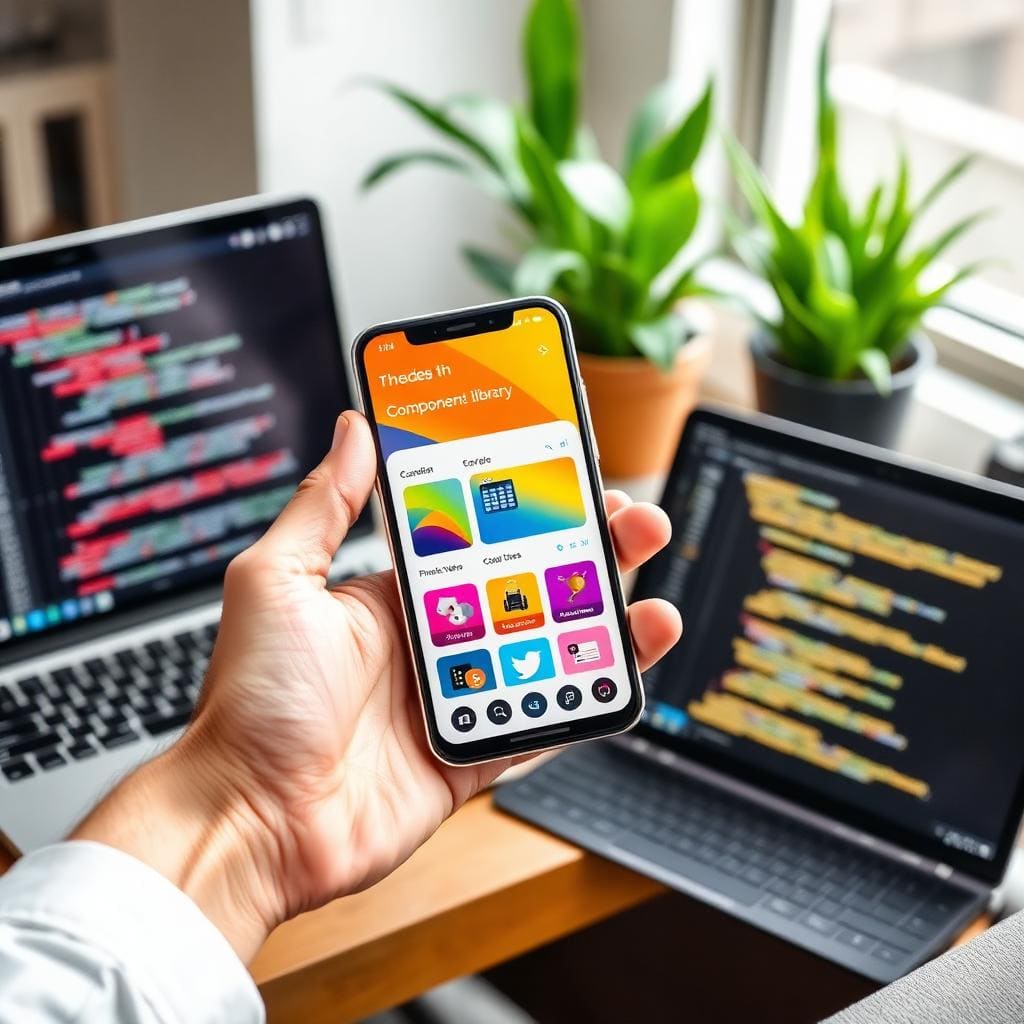
What UI/UX Design Means in 2026
UI/UX design in 2026 has evolved far beyond wireframes and color palettes. Modern design practice encompasses user research, information architecture, interaction design, visual systems, motion design, accessibility engineering, and continuous optimization, all powered by tools and workflows that would be unrecognizable five years ago.
Figma remains the industry standard for collaborative design, now enhanced with AI-powered features like auto-layout suggestions, content generation, and accessibility checking built directly into the design environment. Design systems (comprehensive libraries of reusable components, tokens, and patterns) have become the foundation of every serious digital product.
The 2026 Design Toolkit
- Figma + FigJam for design, prototyping, and collaborative workshops
- AI-assisted design tools that generate layouts, suggest improvements, and audit accessibility
- Design tokens that sync design systems directly with development code
- Advanced prototyping with realistic micro-interactions and data-driven states
- User research platforms integrating analytics, heatmaps, and session recordings
- Automated design QA tools that compare implemented UI against Figma specs
Los Angeles sets the creative standard. The city that houses Hollywood, major gaming studios, and the headquarters of Snap, Riot Games, and countless creative agencies expects design excellence at every touchpoint. A mediocre interface that might pass in other markets actively damages your brand in LA. Consumers here interact with world-class design daily and their expectations reflect it.
Companies in the top quartile of design performance outperform the S&P 500 by 228% over a 10-year period. Design is not a cost center. It is the highest-leverage investment in product success.
McKinsey Design Index, 2026 Update
Why Design Determines Success in Los Angeles
The 50-Millisecond Verdict
Google research confirms users form aesthetic judgments about a website in 50 milliseconds, before they read a single word. In that fraction of a second, visual design, layout quality, and perceived professionalism determine whether a visitor stays or bounces. In LA, where competition for attention is fierce, those 50 milliseconds are your entire audition.
- 50ms first impressions: visual design quality determines stay-or-leave decisions before content is consumed
- Conversion driver: optimized UX increases conversion rates by 200-400%, the single biggest lever for digital revenue
- Mobile dominance: 72% of LA digital interactions happen on smartphones. Mobile UX is the primary experience
- Diversity demands: LA's multicultural market requires inclusive design that works across languages, cultures, and abilities
- Quality signal: in LA's premium market, design quality is a proxy for service quality. Poor UX suggests poor service
- Retention engine: 88% of users never return after a bad experience. UX is the foundation of customer lifetime value
| Design Investment | Without UX Research | With UX Research | Business Impact |
|---|---|---|---|
| Bounce Rate | 55-70% | 25-35% | 2x more visitors engage with content |
| Conversion Rate | 1-2% | 4-8% | 3-4x revenue from same traffic |
| Support Tickets | Baseline | 40% fewer | Lower operational costs |
| Customer Retention | 30-40% | 65-80% | 2x customer lifetime value |
| Development Rework | 35% of budget | Under 10% | Faster time-to-market, lower cost |
| App Store Rating | 2.5-3.5 stars | 4.5+ stars | Higher organic installs |
For LA businesses investing $20,000-$50,000 per month in digital marketing, a 1% conversion rate improvement can represent $200,000+ in additional annual revenue. UX design is not a creative expense. It is the highest-ROI investment in your digital business. Explore how design integrates with mobile app development and custom web development for maximum impact.
The UX Design Process: 7 Phases
Great design is not inspiration. It is process. At Frenchy Digital, we follow a structured seven-phase methodology that eliminates guesswork and ensures every design decision is grounded in research, validated by users, and aligned with business objectives.
Phase 1: Discovery & User Research
- Stakeholder interviews to align on business goals, KPIs, and success criteria
- Competitive analysis of 5-10 competitors in your LA market vertical
- User interviews and surveys: understanding real behaviors, not assumptions
- Analytics audit of existing product (heatmaps, session recordings, funnel analysis)
- Persona development based on research data, not demographics alone
- Journey mapping to identify friction points, drop-offs, and opportunities
Phase 2: Information Architecture
- Content inventory and audit of all existing content and features
- Card sorting exercises with real users to validate navigation structure
- Sitemap and flow diagrams defining every screen and user path
- Navigation design optimized for task completion, not org chart mirrors
- Search and filtering logic for content-heavy products
Phase 3: Wireframes & Low-Fidelity Design
- Low-fidelity wireframes for all key screens and user flows
- Content hierarchy and layout structure before visual design begins
- Early usability testing on wireframes: catch structural issues when changes are cheap
- Responsive breakpoint planning for mobile, tablet, and desktop
- Stakeholder review and sign-off before committing to visual design
Phase 4: Visual Design & UI
- Mood boards and style exploration aligned with brand identity
- High-fidelity mockups with final typography, color, imagery, and spacing
- Icon design and illustration style that reinforces brand personality
- Dark mode and alternate theme variations where appropriate
- Micro-interaction design for feedback, transitions, and delight moments
Phase 5: Prototyping & User Testing
- Interactive Figma prototypes simulating real product behavior
- Moderated usability testing with 5-8 representative users
- Task-based testing measuring completion rate, time-on-task, and errors
- A/B variant testing for critical conversion flows
- Iteration based on testing results, typically 2-3 rounds
Phase 6: Design System & Handoff
- Component library in Figma with variants, states, and documentation
- Design tokens (color, spacing, typography) that sync to code
- Detailed specs for developers: spacing, interactions, responsive behavior
- Animation specifications with timing curves and trigger conditions
- Collaborative handoff sessions: designers working directly with developers
Phase 7: Design QA & Iteration
- Pixel-level comparison of implemented UI against Figma designs
- Cross-browser and cross-device testing for visual consistency
- Accessibility audit (screen reader, keyboard navigation, contrast ratios)
- Performance review ensuring design choices don't compromise load speed
- Post-launch analytics monitoring to validate design decisions with real data
Best Practices for UX Design in Los Angeles
Mobile-First Design
With 72% of LA digital interactions on mobile, design starts with the smallest screen and enhances upward. This is not responsive design. It is fundamentally designing for touch, thumb zones, limited screen real estate, and variable network conditions as the primary experience. Desktop becomes the enhanced version, not the other way around.
Motion Design & Micro-Interactions
Motion design in 2026 is functional, not decorative. Loading states that reduce perceived wait time, transitions that maintain spatial orientation, feedback animations that confirm user actions, and progressive disclosure that manages complexity. LA users expect polish. Motion design is how you deliver it without sacrificing performance.
Accessibility (WCAG 2.1 AA)
Accessibility is a legal requirement and a business opportunity. 15% of the global population has some form of disability. WCAG 2.1 AA compliance means: 4.5:1 color contrast ratios, keyboard navigation for all interactions, screen reader compatibility, focus management, alternative text, and captions. ADA lawsuits against California websites have increased 400% since 2020. Compliance is non-negotiable.
Design Systems at Scale
Design systems are not just component libraries: they are the single source of truth that connects design and development. A well-built design system with tokens, components, patterns, and documentation speeds up development by 30-50%, ensures consistency across products, and reduces design debt. For multi-product companies, a design system is the most efficient investment in quality. Learn how design systems power e-commerce platforms and enterprise applications.
User Testing: Not Once, Continuously
Testing is not a phase: it is a practice. Usability testing at wireframe stage catches 80% of structural issues when changes cost hours, not weeks. Post-launch testing with real analytics validates assumptions. Quarterly user interviews surface emerging needs. The companies winning in LA test relentlessly. Their competitors guess.
Emotional Design & Brand Expression
In a market saturated with functionally equivalent products, emotional design creates differentiation. Personality through copywriting, delight through unexpected interactions, trust through consistency, and belonging through inclusive representation. LA brands that connect emotionally outperform those that only function correctly, because loyalty is emotional, not rational.
Common UX Mistakes That Kill Conversions
| Mistake | Impact | Prevention |
|---|---|---|
| Skipping user research | Designing for assumptions, not real users: 60% of features go unused | Invest 10-15% of budget in research before any design work begins |
| Designing for the CEO, not the user | Stakeholder preferences override user needs: conversion rates suffer | Present research data, not opinions: user testing settles design debates |
| Visual design without UX foundation | Beautiful interfaces that confuse users: high bounce, low conversion | Wireframe and test structure before applying visual design layer |
| Inconsistent design patterns | Users relearn interactions on every screen: cognitive load increases errors | Build and enforce a design system from project start, not retrofit later |
| Over-designing for complexity | Feature bloat and visual noise overwhelm users: key actions get buried | Progressive disclosure: show only what's needed at each step of the journey |
| No design QA process | Implemented product drifts from design: spacing, colors, interactions break | Dedicated design QA phase comparing build to specs across all breakpoints |
Users spend most of their time on other sites. They expect your site to work the same way as all the other sites they already know. Design for conventions, innovate on value, not on navigation patterns.
Jakob Nielsen, Nielsen Norman Group
UX Design Case Studies in Los Angeles
Healthcare Patient Portal: Beverly Hills
- Complete redesign of patient-facing portal for multi-location medical practice
- User research revealed 73% of patients abandoned appointment booking due to confusing flow
- Simplified booking from 7 steps to 3: appointment completion rate increased 185%
- Accessible design (WCAG 2.1 AA) serving elderly patients and those with disabilities
- Patient satisfaction scores increased from 3.2 to 4.7 out of 5 within 3 months
- Support call volume reduced 45%: patients self-serve through intuitive portal design
Fintech Mobile App: Silicon Beach
- Investment platform app designed for millennial and Gen-Z users in LA tech community
- Extensive user research: 30 interviews, competitive analysis of 12 fintech apps
- Gamification patterns and micro-interactions that increased daily active users by 65%
- Dark mode default with adaptive theming based on time-of-day and user preference
- Onboarding flow reduced from 12 screens to 5: completion rate jumped from 34% to 78%
- 4.8-star App Store rating with users consistently citing 'beautiful and intuitive' design
Restaurant Brand System: Multi-Location LA
- Unified design system for 12-location restaurant group across website, app, and in-venue
- Design tokens ensuring consistent brand expression across digital and physical touchpoints
- Location-specific customization within brand guidelines: neighborhood personality maintained
- Online ordering UX redesign increased average order value by 28% through smart upsell patterns
- Integrated loyalty program design driving 40% repeat visit rate from app users
- View more examples on our <a href='/case-studies'>case studies page</a>
UI/UX Design Costs in LA: 2026 Pricing
| Service | Price Range | Timeline | Deliverables |
|---|---|---|---|
| UX Audit | $3,000: $10,000 | 1-2 weeks | Heuristic evaluation, analytics review, recommendations report |
| Mobile App Design | $15,000: $50,000 | 6-12 weeks | Research, wireframes, UI design, prototype, design system |
| Website Design | $10,000: $40,000 | 4-10 weeks | Research, IA, wireframes, visual design, responsive specs |
| Comprehensive Design System | $50,000: $150,000+ | 8-16 weeks | Multi-platform design, tokens, component library, documentation |
- Every $1 invested in UX returns $100: Forrester Research confirmed across 50+ enterprise studies
- Fixing a UX issue after development costs 10x more than fixing it during design: research first
- Design-led companies see 32% more revenue growth and 56% higher total shareholder returns
- LA market demands premium quality: underinvesting in design costs more than investing correctly
- Frenchy Digital offers phased engagements starting with UX audit to prove value before larger commitment
These prices reflect LA market rates for experienced, research-driven design teams. Lower quotes typically indicate template-based approaches or junior designers without research methodology. For products where AI integration is part of the experience, design budgets should account for the additional complexity of designing conversational interfaces and AI-driven personalization.
Frenchy Digital's Design Approach
Research-Driven, Not Trend-Driven
Every project starts with user research (interviews, analytics, competitive analysis) before a single pixel is placed. We do not design based on trends, stakeholder opinions, or competitor copying. We design based on evidence: what your users need, how they behave, and what drives them to convert. This approach consistently delivers 3-5x conversion improvements over assumption-based design.
Design + Development as One Team
At Frenchy Digital, designers and developers work in the same sprints, on the same team. Designers understand technical constraints. Developers understand design intent. This eliminates the handoff gap that causes 90% of "the build doesn't match the design" problems. Our design systems are built to be implemented, not just admired in Figma.
LA Aesthetic, Global Perspective
With studios in Los Angeles, Paris, and Geneva, Frenchy Digital brings a design perspective that is both locally relevant and globally informed. LA's creative energy meets European design rigor: bold, distinctive, and precision-crafted. Our clients include healthcare systems, fintech platforms, luxury brands, and multi-location businesses across Southern California.
Measurable Design Impact
We define success metrics before the first design sprint begins and track them rigorously post-launch. Conversion rate, task completion rate, time-on-task, error rate, NPS, support ticket volume: design is accountable to business outcomes, not subjective approval. If the numbers do not improve, we iterate until they do.
Ready for Design That Converts?
Get a free UX audit from Frenchy Digital: we create research-driven digital experiences for Los Angeles businesses that measurably increase conversion and revenue.
Ready for Design That Converts?
Get a free UX audit and design consultation from Frenchy Digital. We create research-driven digital experiences for LA businesses that measurably increase revenue.
1517 S Bentley Ave Apt 204, Los Angeles CA 90025
Frequently Asked Questions
Sources & References
- 1Nielsen Norman Group: Usability 101: Introduction to Usability↗
- 2W3C: Web Content Accessibility Guidelines (WCAG) 2.1↗
- 3ADA.gov: Web Accessibility Guidance↗
- 4McKinsey: The Business Value of Design↗
- 5Baymard Institute: UX Research & Benchmarking↗
- 6web.dev: Core Web Vitals and User Experience↗
- 7Material Design 3: Google Design Guidelines↗
Related Articles You May Find Helpful
- Mobile App Marketing Services: The 2026 Guide
- Mobile App Design Services: The 2026 UX/UI Guide
- Mobile App Development in Los Angeles 2026
- Custom Web Development in Los Angeles 2026
- E-Commerce Development in Los Angeles 2026
- AI Integration Services in Los Angeles 2026
- AI Chatbot Development in Los Angeles 2026